Tax Buddy
Tax Buddy
Tax Buddy
Reimagining a Tax Filing Platform
Reimagining a Tax Filing Platform
Reimagining a Tax Filing Platform

YEAR
2023
CLIENT
TAX BUDDY
MY ROLE
UI DESIGNER
PROJECT DURATION
3 - 4 Weeks
THE PROBLEM
THE PROBLEM
THE PROBLEM
TaxBuddy aimed to provide a hassle-free tax filing platform, but their core user journey was falling short - especially for new or financially non-savvy users.
We noticed users were dropping off during onboarding and filing due to:
Overwhelming terminology.
Fragmented flow between steps.
Lack of context or handholding during the process.
The challenge was to redesign the journey to feel guided, intuitive, and jargon-free while still covering the necessary legal and financial details.
UNDERSTANDING THE USERS
UNDERSTANDING THE USERS
UNDERSTANDING THE USERS
We started by mapping out the current user flow and identifying friction points.
Using heuristic analysis and stakeholder inputs, we discovered:
Users didn’t understand which filing option to choose.
There was no clarity on required documents upfront.
The process felt transactional and intimidating rather than friendly or helpful.
We grouped the users into two broad categories:
"First-time filers" who needed maximum handholding.
"Repeat users" who wanted a faster, skip-the-basics experience.

DESIGN GOALS
DESIGN GOALS
DESIGN GOALS
Reduce user anxiety by simplifying language and layout.
Create a branching user flow to serve both new and experienced users.
Design a “guided journey” that helps users make decisions confidently.
Improve information hierarchy and form usability.
Reduce user anxiety by simplifying language and layout.
Create a branching user flow to serve both new and experienced users.
Design a “guided journey” that helps users make decisions confidently.
Improve information hierarchy and form usability.
Reduce user anxiety by simplifying language and layout.
Create a branching user flow to serve both new and experienced users.
Design a “guided journey” that helps users make decisions confidently.
Improve information hierarchy and form usability.
REIMAGINED ONBOARDING
REIMAGINED ONBOARDING
REIMAGINED ONBOARDING
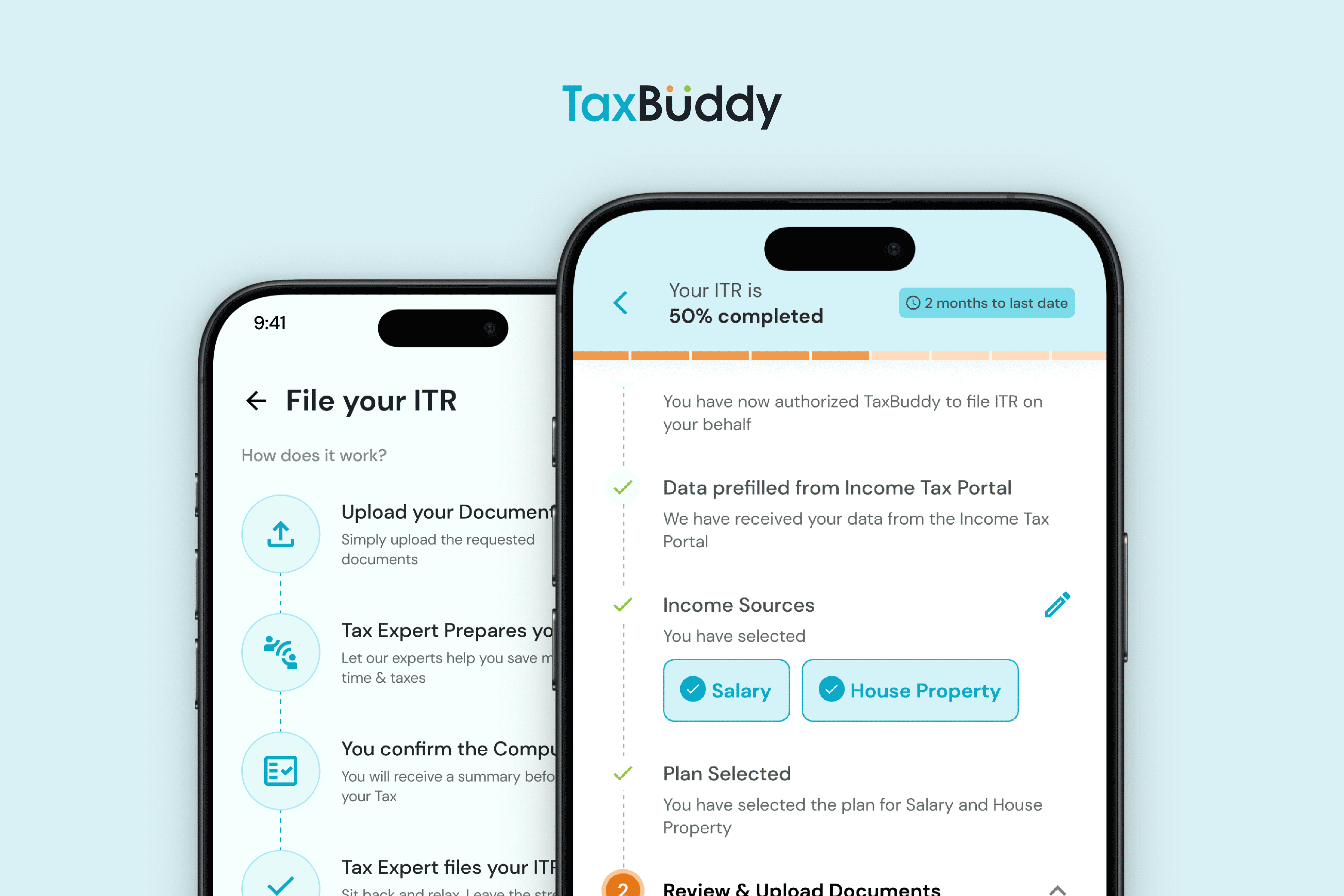
• We replaced the old flat form with a conversational flow.
• Added upfront clarity on required documents and estimated time.
• We replaced the old flat form with a conversational flow.
• Added upfront clarity on required documents and estimated time.
• We replaced the old flat form with a conversational flow.
• Added upfront clarity on required documents and estimated time.

Created a Split Pathway
Created a Split Pathway
Created a Split Pathway
Designed two parallel journeys :
“Help me file my taxes” for new users.
“I know what I’m doing” for experienced users.
This reduced cognitive load and allowed for tailored interfaces
Designed two parallel journeys :
“Help me file my taxes” for new users.
“I know what I’m doing” for experienced users.
This reduced cognitive load and allowed for tailored interfaces
Designed two parallel journeys :
“Help me file my taxes” for new users.
“I know what I’m doing” for experienced users.
This reduced cognitive load and allowed for tailored interfaces

Contextual Tooltips & Help
Contextual Tooltips & Help
Contextual Tooltips & Help
• Introduced subtle nudges and explanations for complex terms.
• Added inline help next to sensitive data points like income brackets.

Progress Indicators and Save Points
Progress Indicators and Save Points
Progress Indicators and Save Points
• Gave users better visibility on how far along they were.
• Let users pause and resume their session.


Impact & Results
Impact & Results
Impact & Results
Redesigning the TaxBuddy experience wasn’t just about aesthetics - it was about reducing friction and building confidence for first-time tax filers. Here's how the redesign made a difference:
Simplified Filing Flow → Reduced Drop-offs
By rethinking the onboarding and step-by-step journey, we created a more linear and guided experience. Users no longer felt overwhelmed by complex forms, and early testing showed a notable drop in user drop-offs during mid-way steps.
Clearer Language & Visual Hierarchy → Increased User Confidence
We replaced jargon-heavy copy with everyday language, and redesigned content blocks to reduce cognitive load. This made the platform more approachable, especially for users filing taxes on their own for the first time.
Mobile-first Approach → Better Accessibility
Recognizing that many users preferred to file on their phones, I focused on a mobile-first design system. The UI was optimized for smaller screens, leading to smoother interactions and fewer support queries from mobile users.
Collaborative Workflows → Smoother Dev Handoff
Working closely with devs, I ensured my designs were implementation-friendly and supported by clear documentation. This improved the design-dev handoff and accelerated the product team’s sprint cycles.
Together, these changes helped position TaxBuddy as a friendlier, more intuitive option in a category often associated with stress and confusion.
Reflections
Reflections
Reflections
This project taught me the power of progressive disclosure and the importance of tone in UX writing.
This project taught me the power of progressive disclosure and the importance of tone in UX writing.
This project taught me the power of progressive disclosure and the importance of tone in UX writing.
More Works coming soon More Works coming soon
Ready When
You Are!
BASED IN thrissur
kerala, india
product Designer
+ vibe coder
Drag over the screen to see more!
Ready When
You Are!
BASED IN thrissur
kerala, india
product Designer
+ vibe coder
Drag over the screen to see more!
Ready When
You Are!
Ready When
You Are!
BASED IN thrissur
kerala, india
product Designer
+ vibe coder
Drag to see more!